Making Changes

Making Changes Digital Melissa

I saw a partial on this quote the other day and it really struck a cord with me. Then I googled the quote to ensure I gave proper credit if it was original. And it was. And there was more to it, which made me like it even more. With it being the start of a new year right now helps make it even more impactful.

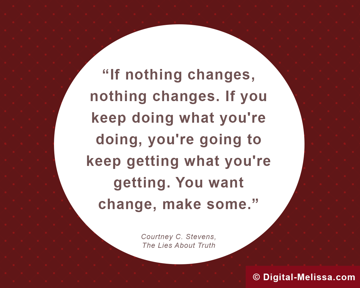
If nothing changes, nothing changes. If you keep doing what you’re doing, you’re going to keep getting what you’re getting. You want change, make some.” – Courtney C. Stevens, The Lies About Truth*

Why did this quote strike me so? I think because although it is so simple, it is also SO TRUE. So much truth in five little words “If nothing changes, nothing changes.” It isn’t like we don’t KNOW this already, but seeing it right there… Bam!

It is so true for so many things. Need to lose weight? You can’t lose weight if you don’t change something. Unhappy in your job? Doing nothing gets you exactly that – nothing. Do you want to learn a new skill? There is no magic pill you can swallow.

If nothing changes, nothing changes! This applies to businesses, too. Do you need more clients? Do you want more brand recognition? Does your website not get enough traffic? Well guess what… Nothing about any of that will change unless you do something to MAKE it change.

So do it, make a change. It doesn’t have to be a big change. Maybe you just drink an extra glass of water. Or maybe you spend 30 minutes a day watching a LinkedIn Video. Or maybe you schedule out a month of Facebook posts for your business. Or you can go big! Take a course, start a weight-loss jumpstart program, redesign your website. So many opportunities!

If nothing changes, nothing changes. Remember it.

And if I can help, let me know.

*Pssssst: if you are interested in the book noted in the quote, you may see it here. I have no idea what it is about and have not read it. This site is a participant in the Amazon Services LLC Associates Program, an affiliate advertising program designed to provide a means for sites to earn advertising fees by advertising and linking to Amazon.com
Jodi’s Fitness Website Redesign & Branding

Jodi's Fitness Logo

Some recent work I have done is for Jodi’s Fitness. Jodi’s Fitness is an established Personal Trainer business in Rhinelander, Wisconsin. Check out her new updated site here! Having set up her website initially on her own in 2015, Jodi decided it was time to give it an update. We got together to go over what sort of ideas she had and came away excited and ready to bring her site up to date!

I was looking forward to the challenge, because Jodi’s site was built using Wix, which I had no experience using for site development. I was grateful she was open to me learning while helping her. Wix turned out to be a very impressive tool. Having previously only used home-grown CMSs or WordPress, it was really exciting to see how slick Wix was for website building. I love having this in my toolbox for future clients.

Quote from Jodi on our experience working together:
“Working with Melissa on this project was stress free and easy. From our first meeting, Melissa asked questions that made me feel like you were in the process of “understanding” me and my business. Running a Personal Training business; “I” am my brand name and business. I am actually the product and you understood that.”

Jodi and I decided on a theme, colors, discussed updating her logo, nailed down the pages we needed, scheduled a photo shoot and discussed the SEO value of her site. Her site is highly ranked in her key search terms so we did not want to damage that.

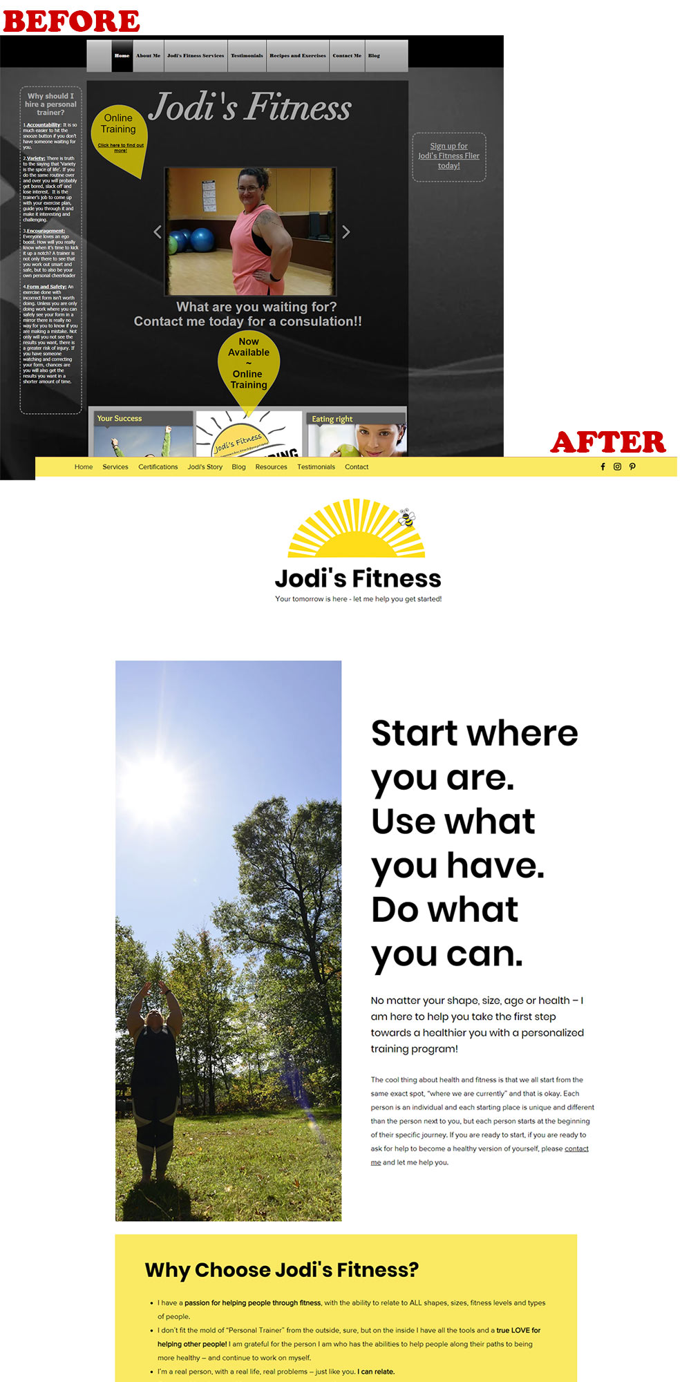
Jodi’s Fitness successfully launched with a fresh, updated design, new logo and stunning photography. See some examples of the before & after below.

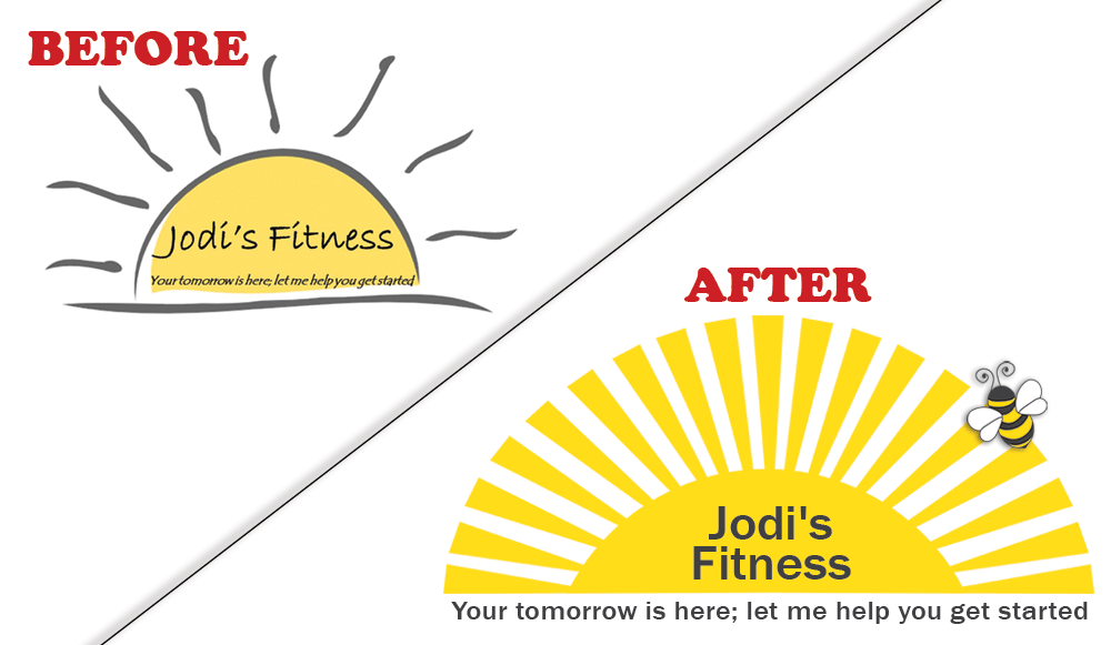
Jodi's Fitness updated logo
The bee in the new logo was a new element Jodi felt strongly about, so we incorporated it into the logo and within the site.
Jodi's Fitness Website Update

Updating websites is always a fun project to add to recent work portfolio. This one was especially fun because it was almost an entire site launch, as we added several pages and introduced an entirely new look for the whole website. We also utilized Wix’s new builder application. Working with Jodi was great fun and she caught on how to utilize the new interface quickly after just a little bit of guidance. I feel it is always important to ensure the site owner feels comfortable updating their site if they want. I am always here to help in the future, but being empowered to do so is vital for many business owners.

Illustrated Bee
Fresh illustration using Adobe Illustrator of a bee made for Jodi’s Fitness

Quote from Jodi on our experience working together:
“As the plan unfolded and as the website was created, Melissa always listened to the small things that I wanted tweaked and she let me have say in the process. The fact that my ego was allowed to participate in my website helped to keep me at ease during the process. Melissa never wavered and never showed frustration through the entire process. I would not hesitate to recommend Melissa to any of my friends and business acquaintances.”

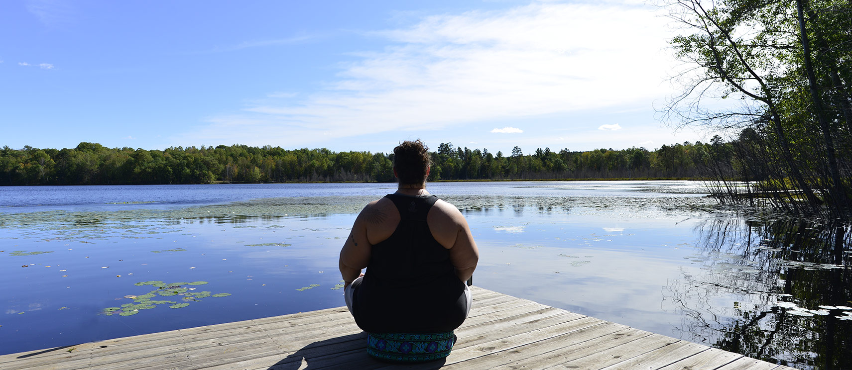
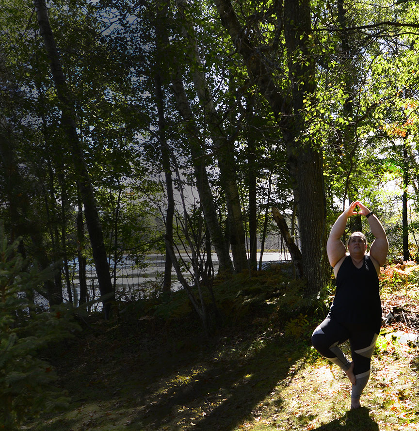
We also did a photo shoot indoors and outdoors to utilize on the website. Some of the images turned out so amazing! It was fun to do and also a good refresher for me as I had not done too much “real” photography since my college years. Take a look at a few:

Jodi's Fitness Photoshoot Outdoors
Jodi was a great model and had terrfic ideas to get her ideas across
Jodi's Fitness
Image shot specifically for Instagram, Facebook and Pinterest use
Jodi's Fitness Photography
Hard to go wrong with photography and this beautiful vista

About Digital-Melissa: I am a veteran of all things internet, located in Rhinelander, WI. 20 years in eCommerce with everything from design to copy, social media, marketing, project management, website help & management plus more. Contact me today if you’d like to talk about how I could help your business.

Password Fields Usability Issue

I have a bone to pick with so many websites! Password fields usability WHEN LOGGING IN. This is not to be confused with account setup password field. Hopefully businesses have that figured out by now..

Password fields usability should be one of the top priorities for any online business. And yet they are the biggest pain in the a** fields most of the time. This problem is because none of us can recall our password, or maybe we are smart enough to have some sort of program that does it for us (I don’t). Or maybe you have them logged somewhere but it’s a pain to dig up… the reasons this area is annoying goes on and on.

We can fix this password field usability issue by implementing a very easy fix:

  • Include text telling people what is required for your password field

How does this help? I have a lot of passwords (don’t we all?), and mostly they are built upon some other password as time goes on. So if you tell me that your password requires Caps, Special Character and Number – I’m going to figure out which one it is a whole lot more quickly. See the perfect examples below.

Password field usability example
Here is a great example of a login password field, telling me right away what I need to know.

It is also helpful is if the business can tell me what information is missing. Is it the lenght? Is it the uppercase or special character? See a great example below:

Password field usability example
Great example of telling me what I did wrong, in case I missed it the first time.

This is a relatively simple fix for the password field during login for usability. Ease of use is always the #1 priority of any website, so digging into these areas that are frequented is vital. This small fix could very easily translate to more conversions for your business.

About Digital-Melissa: I am a veteran of all things internet, located in Rhinelander, WI. 20 years in eCommerce with everything from design to copy, social media, marketing, project management, website help & management plus more. Contact me today if you’d like to talk about how I could help your business.